Role
Senior Designer
Agency
Deutsch LA
Year
2020
Role
Senior Designer
Agency
Deutsch
Year
2020
Role
Senior Designer
Agency
Deutsch
Year
2020
Almonds.com
The Almond Board of California supports the almond growing community by developing global market demand for almonds as well as investing in research to help improve farming and processing practices.
The organization supports a multitude of audiences from consumers to industry and health professionals across North America, Europe and Asia.
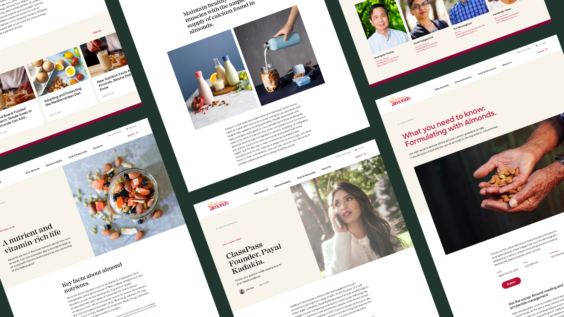
Our mission was to elevate Almonds.com into something to do, not just read. We redesigned the website with the idea of it being a modern-day, aspirational library for the almonds community—a place where work gets done, a deep well of knowledge can be found, and big ideas are born.
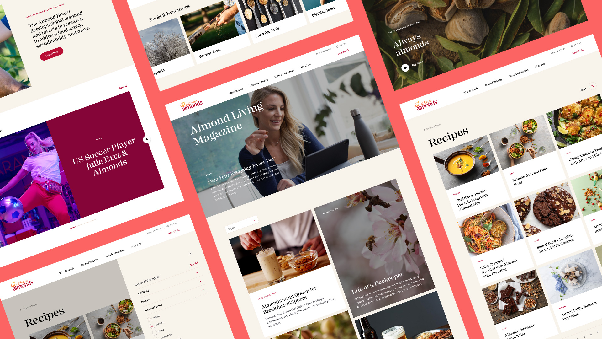
The end result is a useful, modern website— with a flexible design system to adapt to global audiences. Combined with a machine-learning search engine, almonds.com became the place to speak to almond growers and almond lovers alike.
Almonds.com
The Almond Board of California supports the almond growing community by developing global market demand for almonds as well as investing in research to help improve farming and processing practices.
The organization supports a multitude of audiences from consumers to industry and health professionals across North America, Europe and Asia.
Our mission was to elevate Almonds.com into something to do, not just read. We redesigned the website with the idea of it being a modern-day, aspirational library for the almonds community—a place where work gets done, a deep well of knowledge can be found, and big ideas are born.
The end result is a useful, modern website— with a flexible design system to adapt to global audiences. Combined with a machine-learning search engine, almonds.com became the place to speak to almond growers and almond lovers alike.
View the website

Color Palette
Color Palette
Color Palette
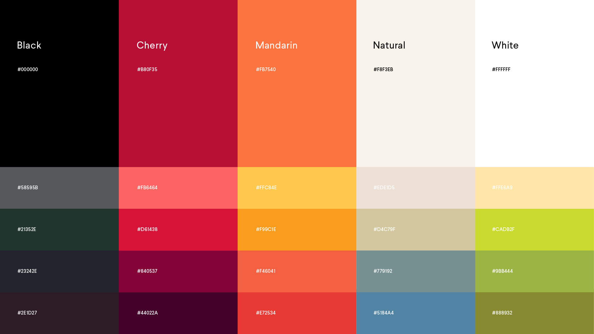
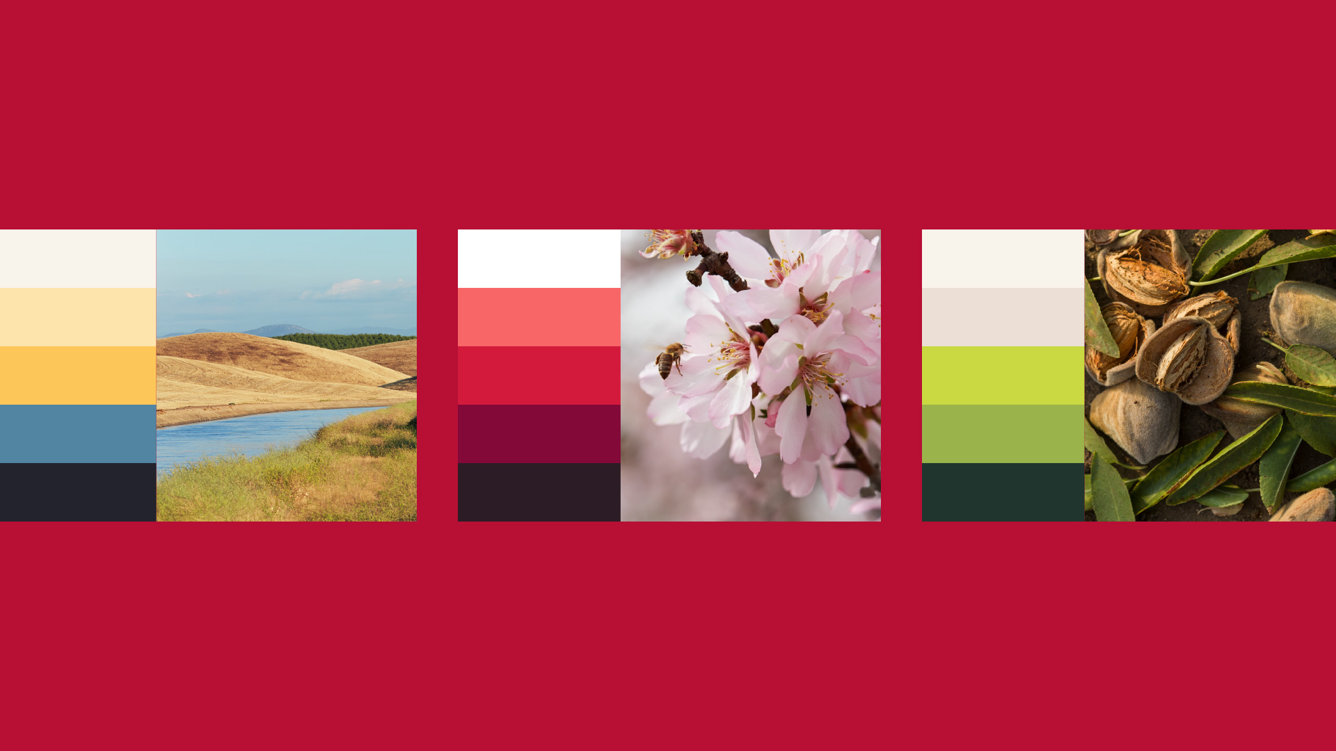
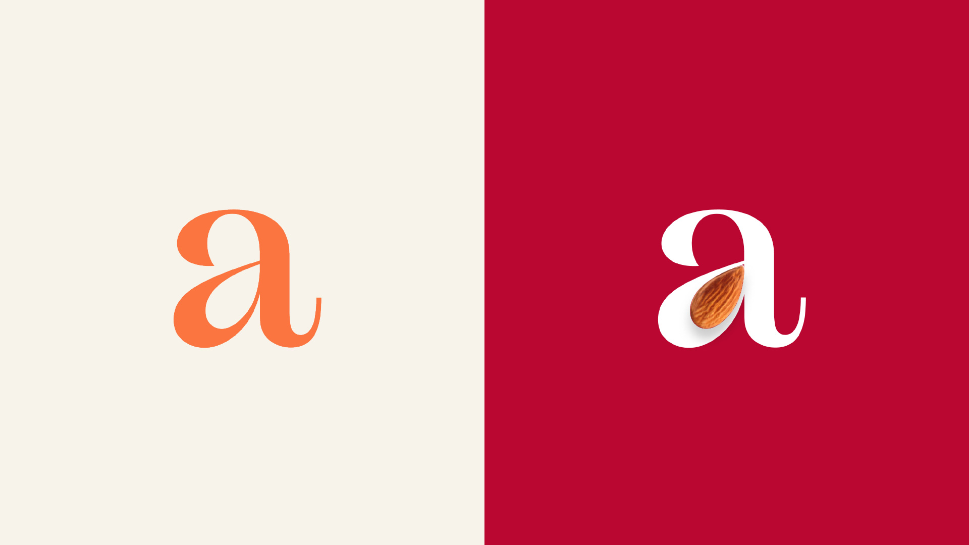
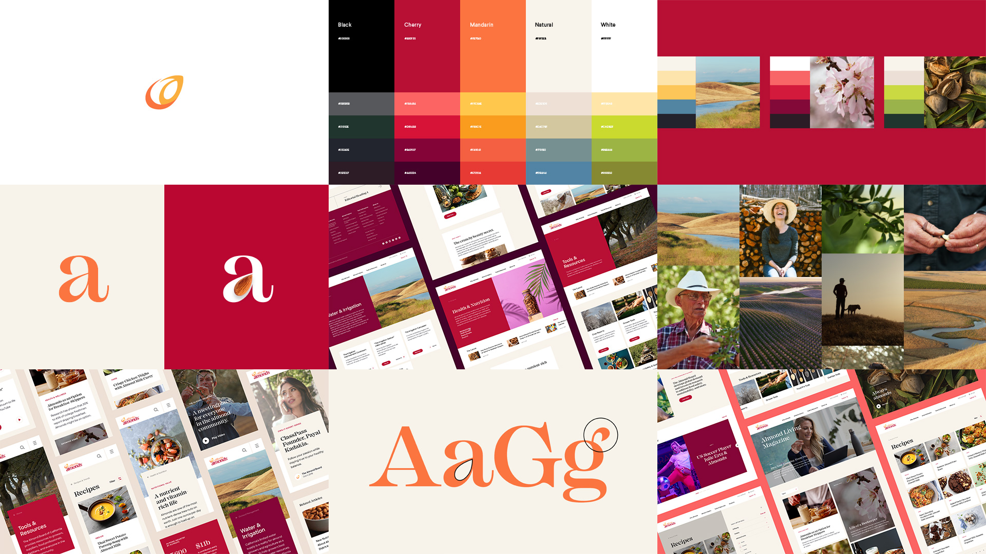
The primary digital palette is inspired by the original Almonds.com website, but stripped back to focus on the cherry and orange featured on the logo. An expansive secondary color palette, inspired by the California almond landscape, was created as an extension of the current brand colors and is used for everything from campaigns to UI elements.
The primary digital palette is inspired by the original Almonds.com website, but stripped back to focus on the cherry and orange featured on the logo. An expansive secondary color palette, inspired by the California almond landscape, was created as an extension of the current brand colors and is used for everything from campaigns to UI elements.
The primary digital palette is inspired by the original Almonds.com website, but stripped back to focus on the cherry and orange featured on the logo. An expansive secondary color palette, inspired by the California almond landscape, was created as an extension of the current brand colors and is used for everything from campaigns to UI elements.
The primary digital palette is inspired by the original Almonds.com website, but stripped back to focus on the cherry and orange featured on the logo. An expansive secondary color palette, inspired by the California almond landscape, was created as an extension of the current brand colors and is used for everything from campaigns to UI elements.
Typography
Typography
Typography
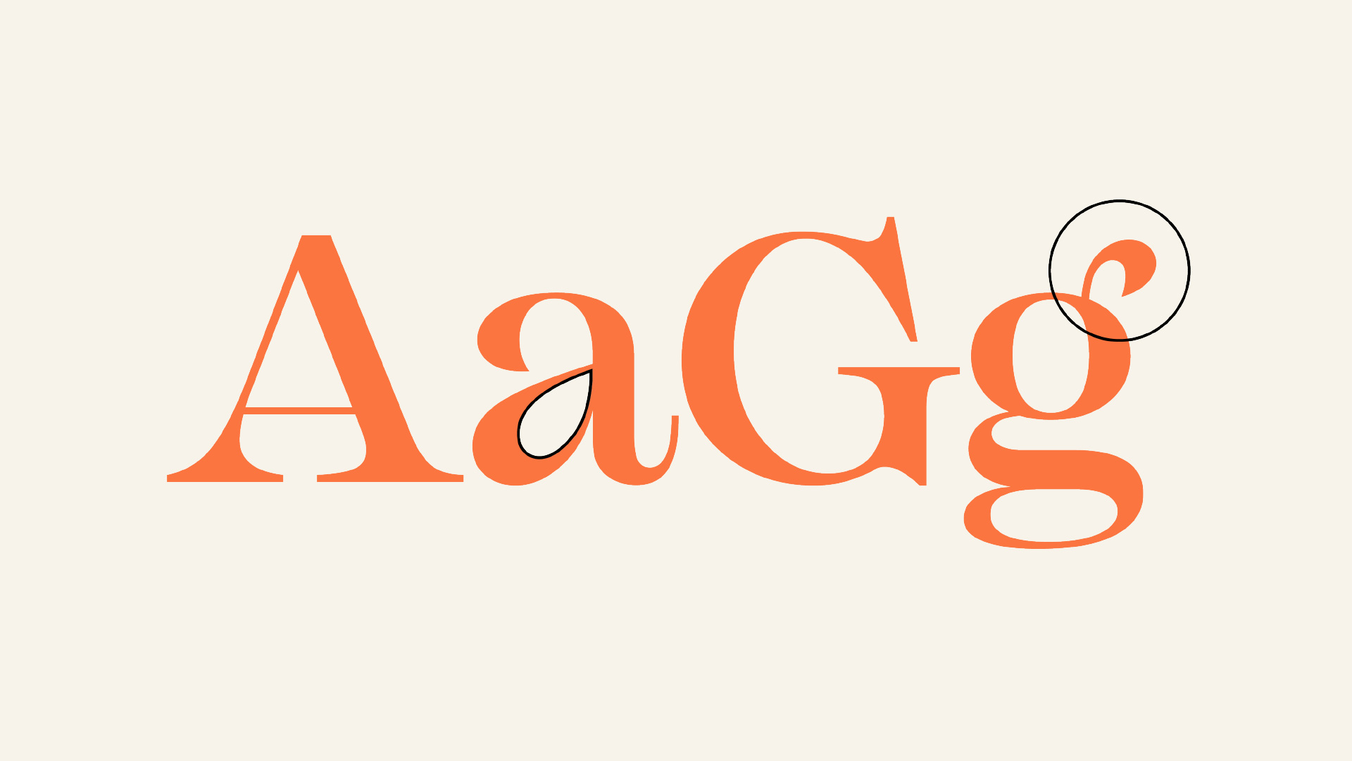
We paired their primary brand typeface (Sharp Sans) with a secondary typeface to create an editorial feel. Mackay is a powerful and elegant serif font with curvy / organic details that link back to the almond product. For all character-based languages, we use Mackay for numbers and editorial-based English headlines.
We paired their primary brand typeface (Sharp Sans) with a secondary typeface to create an editorial feel. Mackay is a powerful and elegant serif font with curvy / organic details that link back to the almond product. For all character-based languages, we use Mackay for numbers and editorial-based English headlines.
We paired their primary brand typeface (Sharp Sans) with a secondary typeface to create an editorial feel. Mackay is a powerful and elegant serif font with curvy / organic details that link back to the almond product. For all character-based languages, we use Mackay for numbers and editorial-based English headlines.
We paired their primary brand typeface (Sharp Sans) with a secondary typeface to create an editorial feel. Mackay is a powerful and elegant serif font with curvy / organic details that link back to the almond product. For all character-based languages, we use Mackay for numbers and editorial-based English headlines.
Photography
Photography
Photography
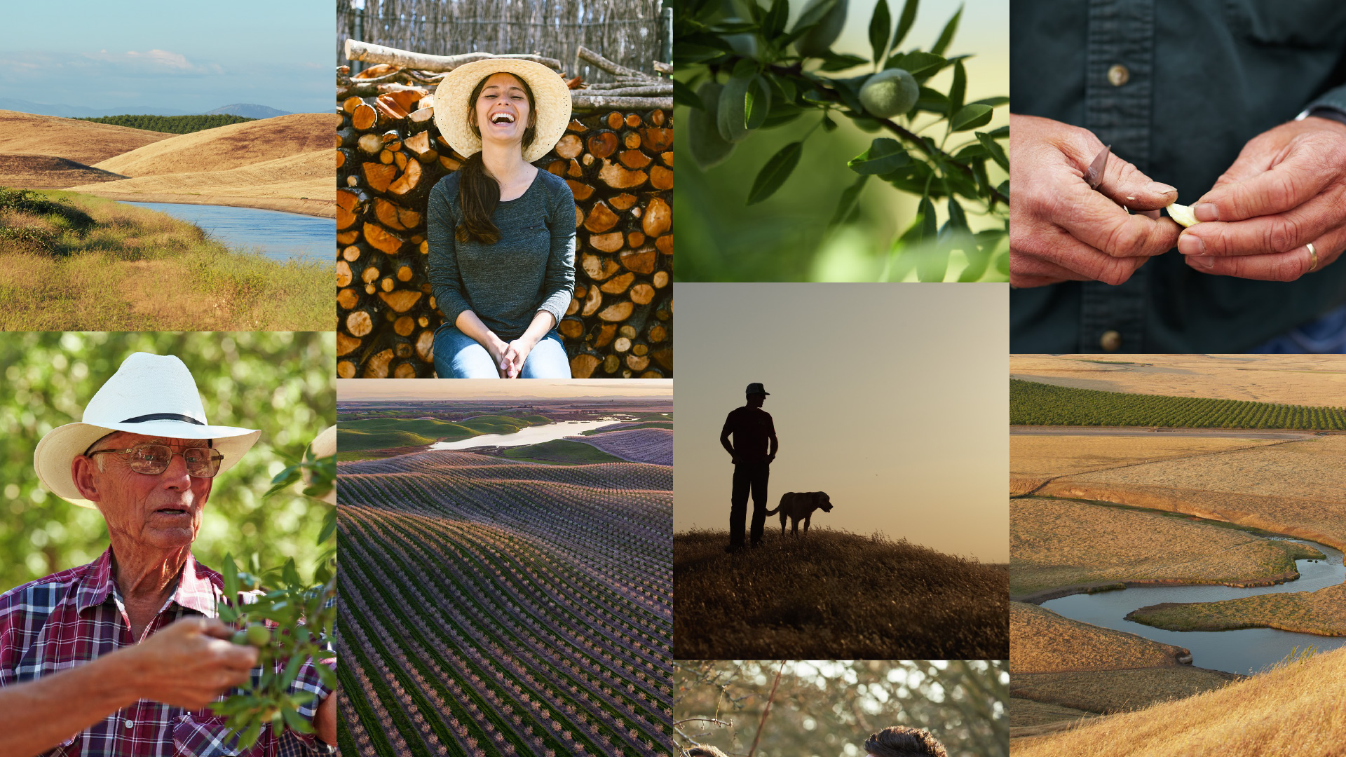
The photography style is laid-back, confident, organic, and warm. Almonds are shown with texture, contrast and focus. Orchard photos show a sense of vastness, wonder and serenity. Industry photos show process and movement whilst having a sense of warmth with human interaction. People are shown with calm, relaxed demeanors—never posed or forced.
The photography style is laid-back, confident, organic, and warm. Almonds are shown with texture, contrast and focus. Orchard photos show a sense of vastness, wonder and serenity. Industry photos show process and movement whilst having a sense of warmth with human interaction. People are shown with calm, relaxed demeanors—never posed or forced.
The photography style is laid-back, confident, organic, and warm. Almonds are shown with texture, contrast and focus. Orchard photos show a sense of vastness, wonder and serenity. Industry photos show process and movement whilst having a sense of warmth with human interaction. People are shown with calm, relaxed demeanors—never posed or forced.
The photography style is laid-back, confident, organic, and warm. Almonds are shown with texture, contrast and focus. Orchard photos show a sense of vastness, wonder and serenity. Industry photos show process and movement whilst having a sense of warmth with human interaction. People are shown with calm, relaxed demeanors—never posed or forced.
Website
Website
Website
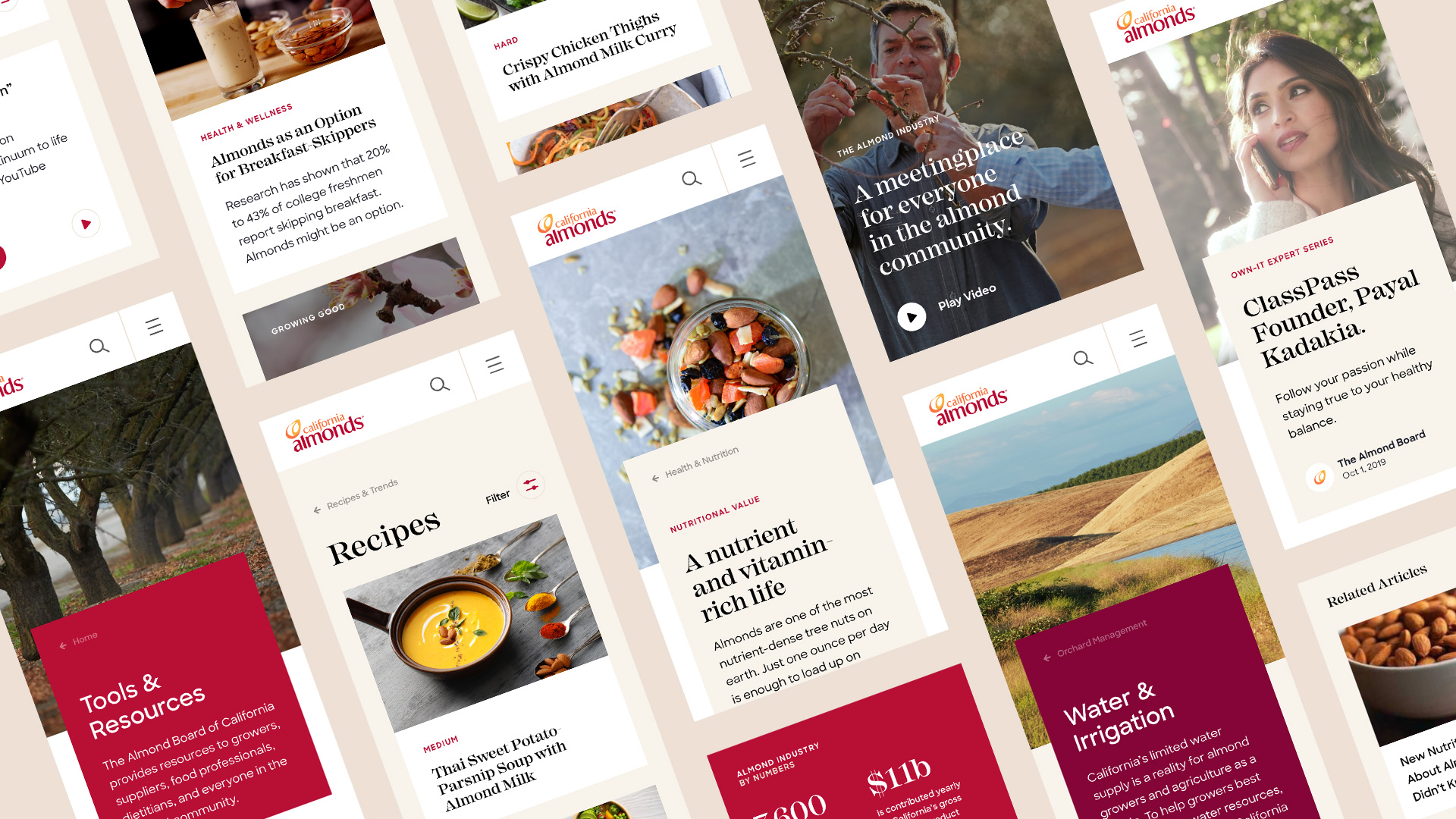
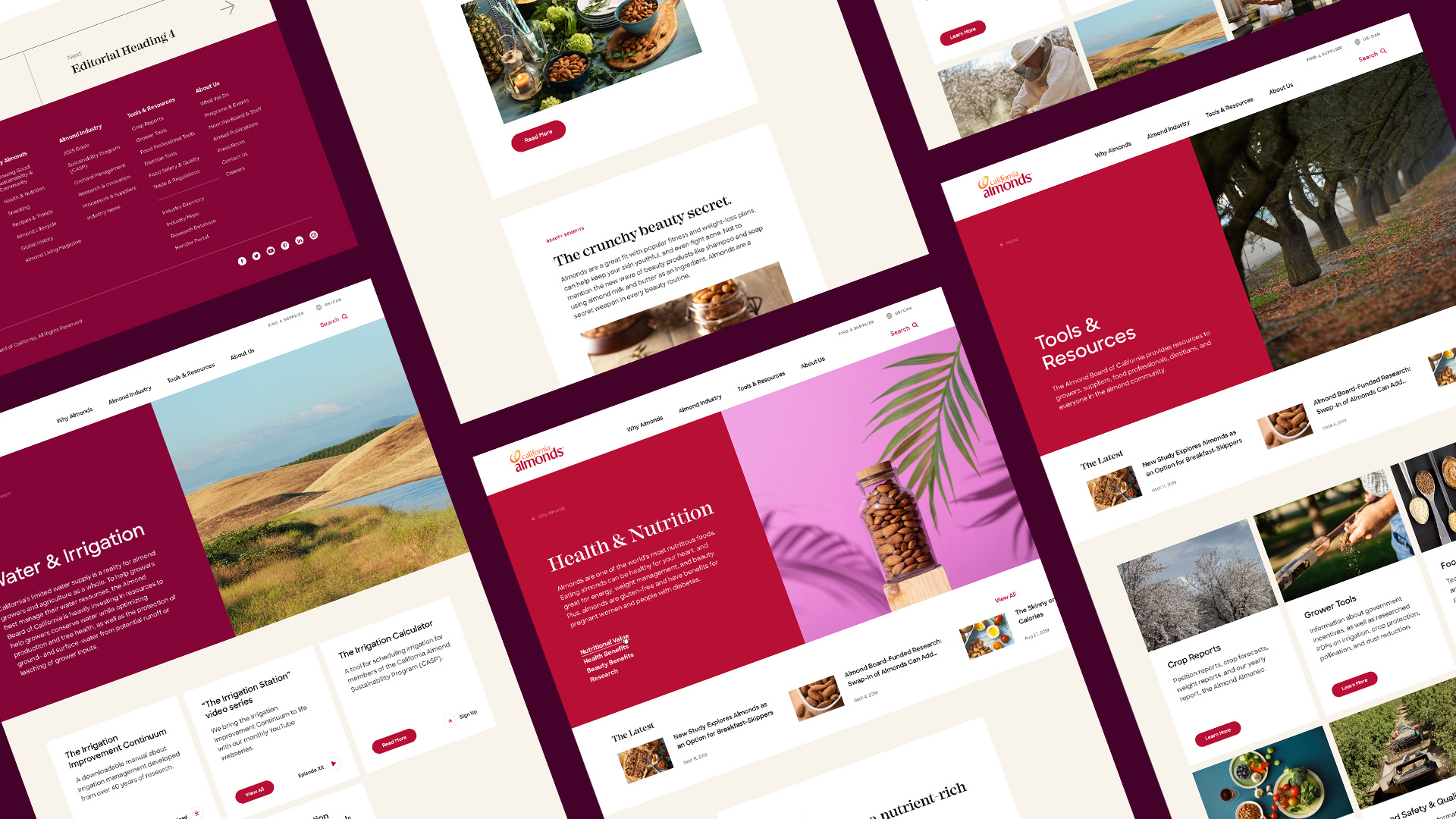
The final product is a global website that is useful, relatable, responsive, modern and elegant. The design approach is minimal and clean with the use of extensive white space and intentional moments of utility. The photography alongside the use of organic, natural colors provide a sense of warmth that is inviting and personable.
The final product is a global website that is useful, relatable, responsive, modern and elegant. The design approach is minimal and clean with the use of extensive white space and intentional moments of utility. The photography alongside the use of organic, natural colors provide a sense of warmth that is inviting and personable.
The final product is a global website that is useful, relatable, responsive, modern and elegant. The design approach is minimal and clean with the use of extensive white space and intentional moments of utility. The photography alongside the use of organic, natural colors provide a sense of warmth that is inviting and personable.
The final product is a global website that is useful, relatable, responsive, modern and elegant. The design approach is minimal and clean with the use of extensive white space and intentional moments of utility. The photography alongside the use of organic, natural colors provide a sense of warmth that is inviting and personable.
“A world-class website that delivers on all fronts – content, searchability and an overall aesthetic and design that invites visitors to stick around and return frequently.”
— Jenny Nicolau, Senior Manager of Industry Relations and Communications
The Almond Board of California
“A world-class website that delivers on all fronts – content, searchability and an overall aesthetic and design that invites visitors to stick around and return frequently.”
— Jenny Nicolau, Senior Manager of Industry Relations and Communications
The Almond Board of California
The Team
Head of Design: Adhemas Batista
Design Director: Jean-Lou Renoux
Designers: Karen Pham, Amy Lee
UX Director: Elizabeth Cordingley
UX Designer: Angie Kang
The Team
Head of Design: Adhemas Batista
Design Director: Jean-Lou Renoux
Designers: Karen Pham, Amy Lee
UX Director: Elizabeth Cordingley
UX Designer: Angie Kang
The Team
Head of Design: Adhemas Batista
Design Director: Jean-Lou Renoux
Designers: Karen Pham, Amy Lee
UX Director: Elizabeth Cordingley
UX Designer: Angie Kang